T-Mobile
Role
Visual Designer
Duration
2015-2016
Intro
As one of the most prominent mobile operator companies in the U.S., T-Mobile is known for their Uncarrier view, which defies standard carrier rules. With the rise of online shopping, this project aims to create a better, reliable, and pleasant shopping experience.
Check In
One of the main goals of this project is to minimize the dropout online shoppers rates. We did that by adding human touch and interaction with online customers. We revamped the cart and checkout design to create a better user experience. The genuine human experience is highly valued in our automated society, and that’s what we want to plant in this shopping experience. We created a revolutionary way to do online shopping by having T-Mobile Experts personally talk to each customer to confirm their orders. This is how the ‘check in’ concept was born. While checking out means the customer is ending a service accompanied by bills and charges, checking in creates a welcoming atmosphere to a new pleasant journey. We believe checking in will reinforce a positive vibe to this shopping experience. Introducing a new concept, we added a 1-2-3 step in the home page marquee to set up the right expectations and step-by-step guide for the customers.
Credit Selector
One of the highest customer drop-out cases on the T-Mobile site is because of different credit scores. While one customer has a perfect credit score and can pay $0 upfront, another customer might have a bad credit score and have to pay full price upfront. By adding this credit selector piece, we believe that this will increase customer’s confidence. No matter how much you pay upfront, the total payment between all credit scores is the same. This is represented by the whole circle in the pie chart. You may divide the pie in any way, but the pie as a whole will be the same. We also added different descriptions on each credit score to explain credit further.
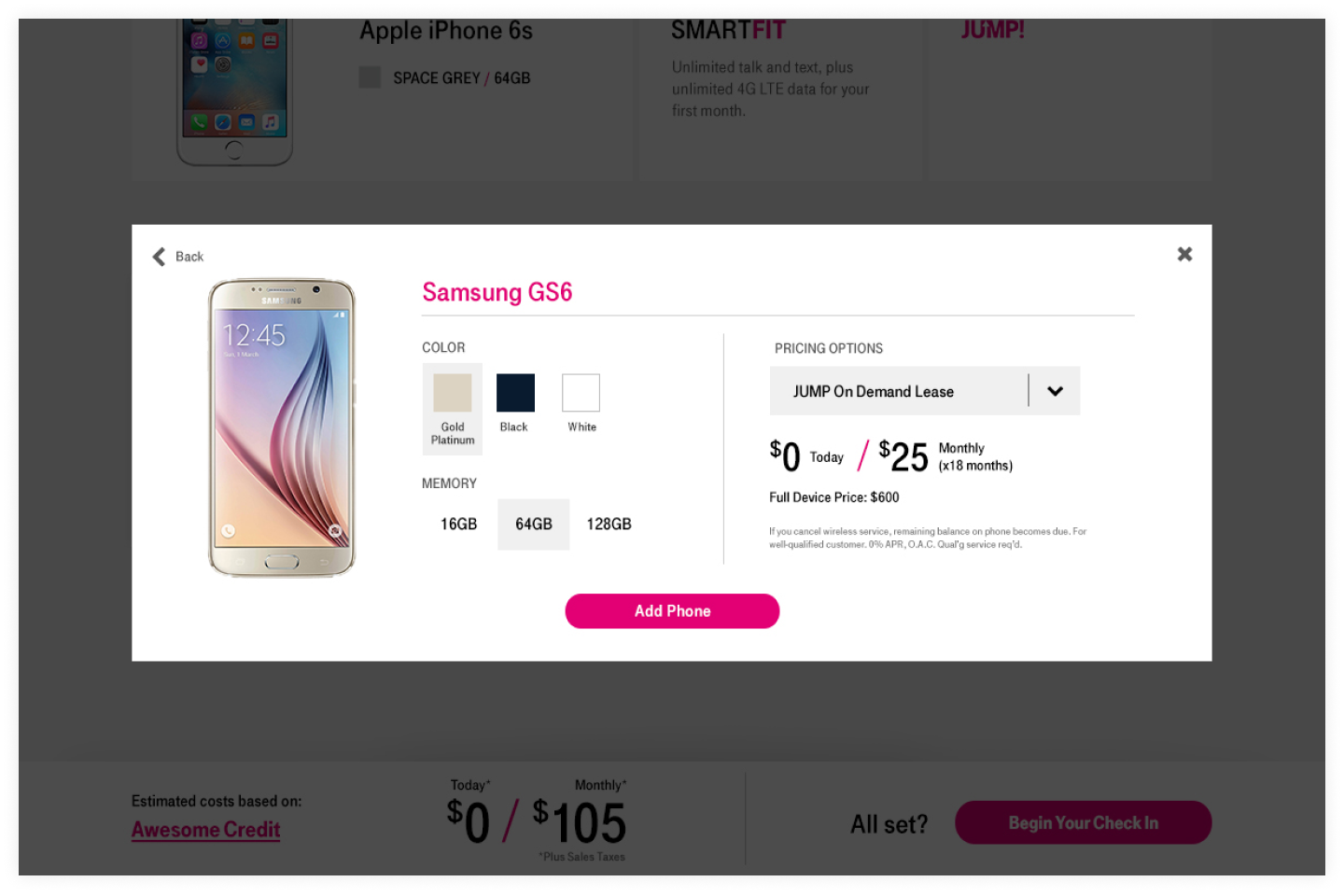
Cart & Checkout
Creating a personalized cart and making smart recommendations is one of the goals of this project. Easy access to all features available and make transparent pricing creates a user-friendly atmosphere.
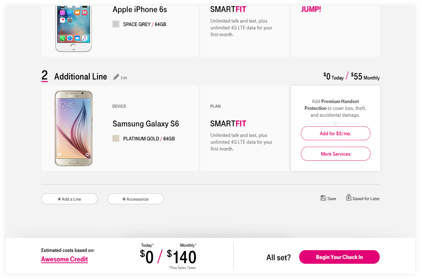
One of the biggest goals to achieve in the checkout stage is to create a simpler form filling process. We do that by dividing the process into three steps, which also serve as hot links. Inside each phase, form fields are ready to be filled out. And once the customer filled those out, the information is condensed, and more related form fields will show up. This will create better organization and minimize scrolls. T-Mobile Expert is shown on the top banner to ensure that help is always available when needed. The expectation of a call with a T-Mobile expert is mentioned throughout the shopping experience. It is reinforced again on the thank you page. The information presented in this page is meant to prepare the customers for the next steps and welcome them to the T-Mobile family.


Thank you for checking out my case study!
Let’s connect! jessica.andriany@gmail.com